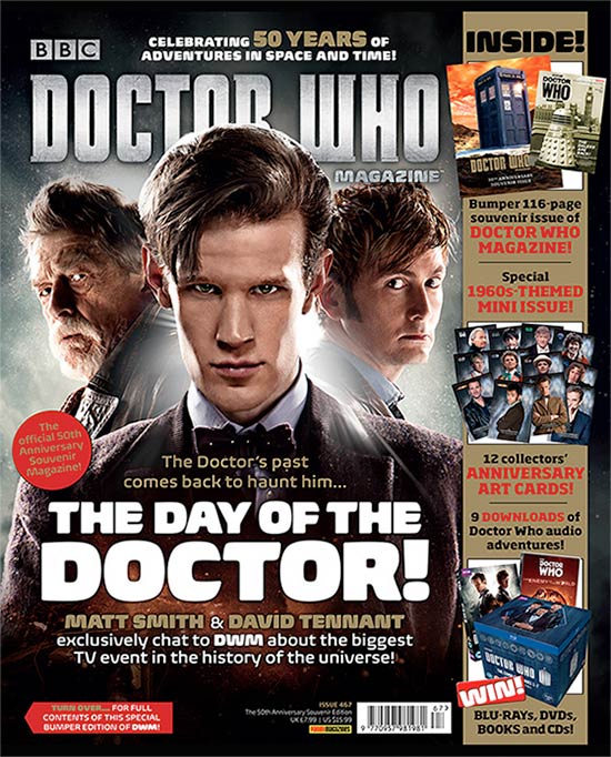
Title of publication:
-
The title of this magazine is slightly obscured
by the head of the protagonist from the obvious main character from the
Programme Doctor Who and the font that they have used is the font used as the
title of the programme giving the sense that the magazine is special and unique
to all the other in sense making it a collectable. The typography title of the
magazine is large compared to the rest of the typography on the mag thus making
it the most important and this make the reader look at this area of the
magazine first then it leads the eye down as reading the title leads the reader
to the ‘Name Check’.
Slogan:
-
This slogan serves its purpose as it sum up the
content of the mag in a line. The slogan on this magazine is very similar to
the font of the title and this then help keep the appearance of being
futuristic. The slogan is very simple and very cliché so this makes it very
easy for the reader to remember in a way it very catchy because of the
simplicity. They have highlighted words like 50 years to show the age and
create a value to the programme and this is them emphasised by the colour that
has been used ‘Gold’ this may refer to the Golden age on the value that gold
have and this connects to the reader especially if the readers are slightly
older as this may be nostalgic. The lettering of the slogan is in capitals
letters and although being small it shows the importance of the 50 years. The slogan is at the top of the magazine and
this also adds to its importance.
Central Image:
-
The central image consists of the doctor from
‘2013’ and previous and show all three generation of the doctors at the time
and therefore at the time the doctor in the centre between the other two was
the newest and this is evident as a light glow behind his head show he’s more
superior and more relevant giving him a
god like image, the light then bleaches out the other two doctor lightly this
could mean that he out shines them, and this is emphasised by him standing ahead
of the other two doctors .Compared to the previous doctor behind the centre
protagonist, they seem slightly rough this give the reader a refreshing feeling
and gives of a sense that the series with this actor in it is better and more
improved. All three actor look directly towards the camera and this to the
reader make them feel part of the legacy that has been created by them. The
shadow created by the main doctor cover the previous doctor and this in sense
show that these actor are over shadowed by a new replacement.
Flash / Cover Lines
-
THE DAY OF THE DOCTOR - this shows part of the main focus as the text
size of the typography is large making it the second largest convention and
therefore catches the readers eye then leading them on to the lower half of the
magazine what emphasis this is the use of White lettering and this is
completely different to the rest of the cover because the image used for the
cover is fairly dark, the white lettering give of a sense of futuristic feeling
staying with the theme of the ,magazine cover.
Free Offer:
-
The magazines offer 12 free collectable cards
for the anniversary of the programme to engage the reader on to the doctor who
magazine more and in the magazine company the typography used to advertise them
is in capital letter and gives of a sense of excitement to the reader.
Colour Scheme:
-
The colours used in the magazines are Red, Blue,
Black, White and Gold these colour are used to give of a futuristic feeling
again flowing with the Doctor Who theme. There isn’t many colours used in this
issue so that the composition of this magazine doesn’t appear to be too busy
and this allows the reader to easily focus on the cover with out them being
confused or even so that their laziness doesn’t get in the way of them
understanding the cover – it makes the magazine look clean cut. Colours such as
Blue are seen as iconography as this colour represent the phone booth which it
self is iconic to Doctor Who.
Name Check:
-
These boxes give further information about what
is inside the magazine that may interest the readers such as stories and
articles this info may appeal to another audience that isn’t the primary
target. In this magazine the Name Check consists of the free gift, competition,
and bumper issue of the magazine.
Language:
-
The language consists of many different typographies
including the sizing of the font which s all very different the larger the font
to larger the focus there is meant to be on them the font and colour also
determine this as of the font has a certain style to it may appeal to the
readers more and make them focus on a certain section of the magazine first in
this case it is the title of the magazine which is large; has a stylish font
and is coloured. The day of the Doctor has a ring to it possibly because it
almost has alliteration.
Competition:
-
In the name check there is a section that shows
a chance to win a box set of the Doctor Who series, books and CD’s how ever
what specifically is given away in the magazine isn’t clear as it says what is
given away which excites the reader and make want to enter how ever doesn’t
give away how to enter the competition and them forces them to buy the magazine
to find out.
Direct Address and Asking Questions:
-
The magazine doesn’t exactly directly address
the reader whoever the Doctors in the magazine cover directly look at them and
this makes reader feel apart of the magazine. It doesn’t include any Question.
-
The
barcode, date and price are small as the cover editor didn’t want the magazine
doesn’t exactly directly address the reader whoever the Doctors in the magazine
cover directly look at them and this makes reader feel apart of the magazine.
It doesn’t include any Question.The ‘real’ Target audience the target audience is clearly fans of the
programme Doctor Who as the cover of this magazine is dedicated to 50 year that
the programme has been running
No comments:
Post a Comment